As many Excel users know, charts are a great way to visualize your worksheet numbers, making it easier to summarize trends, changes, and other key data. Excel Sparklines are charts with a twist–they are tiny charts that actually fit inside one cell. Although Sparklines were first introduced with Excel 2010, many Excel users are still unfamiliar with this graphical feature. Once you try them, Sparklines might be a great tool in your Excel toolbox for quickly and visually graphing your key data without the need to build separate charts and graphs.
In this article and video, learn more about how you can create mini charts in Excel with Sparklines.
Excel Sparklines Show a Quick Snapshot or Trend
Because Sparklines act as a handy and compact reference, you can place them near or even behind the data itself. You can also use them to highlight maximum or minimum values. Although Sparklines look like mini charts and can sometimes take the place of a chart, this feature is purposely basic and completely separate from the more robust charting feature in Excel.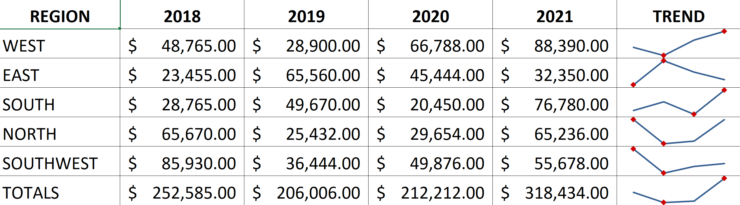
How to Insert and Format a Sparkline
To insert a Sparkline into an Excel worksheet:
 Select the range that contains the data you want to graph as one or more Sparklines. Unlike Excel graphs, do not include headings or labels. Only select the numerical data. The data for each Sparkline must be in a single column or row. (You can also highlight the data from the Create Sparklines dialog box).
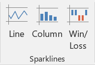
- Next, click the Insert tab in the Ribbon, then pick the Sparkline type you want in the Sparklines group (Line, Column, Win/Loss).
- The Create Sparklines dialog box opens, where you select the cell or range where you want to insert the Sparkline. Verify or change the data range you want to work with.
- Select or enter a parallel range of cells for the location of the Sparklines. They can be displayed above, below, to the left, or the right of the data range.
 When you click OK, the Sparklines appear in the location you selected.
 Select the range that contains the data you want to graph as one or more Sparklines. Unlike Excel graphs, do not include headings or labels. Only select the numerical data. The data for each Sparkline must be in a single column or row. (You can also highlight the data from the Create Sparklines dialog box).
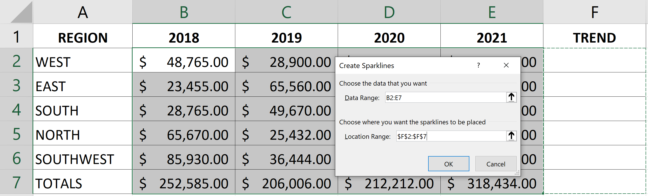 When you click OK, the Sparklines appear in the location you selected.
Once you add Sparklines to your worksheet, you can change the formatting to show different points, styles, colors, markers, and other visual references. For instance, you might want to show the High Point and Low Point markers on a line chart. These can even be formatted with specific color choices, such as green for high and red for low.
To change the look of a Sparkline:
- Click a cell in the range with your Sparklines.
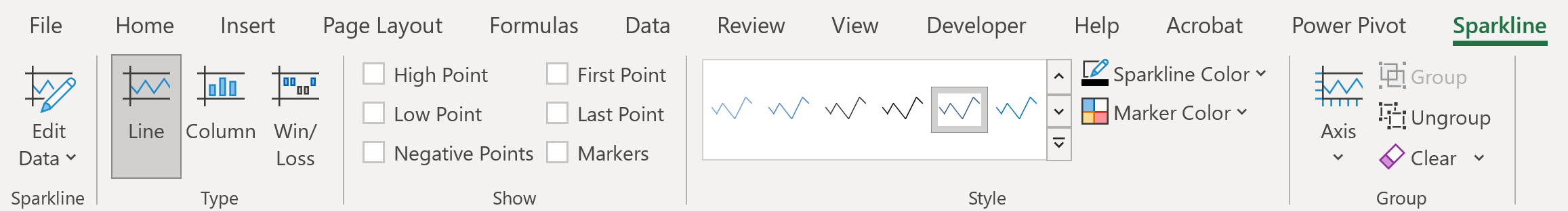
- Select the Sparkline contextual tab if needed (shown below).
- Pick a new style or change other formatting options from the choices in the Ribbon.
- Click into a different worksheet cell to continue your work. Any changes in the worksheet data will be updated in the Sparklines.
Sparklines are a great and useful visual improvement to your work in Excel!
To learn more about Microsoft Excel, check out these additional shortcuts, tips, and techniques at TheSoftwarePro.com/Excel.
© Dawn Bjork, MCT, MOSE, CSP®, The Software Pro®
Microsoft Certified Trainer, Productivity Speaker, Certified Speaking Professional